Edubirdie
From Confusion to Clarity:
Mobile UX That Delivers +34% Growth
Introdaction
Edubirdie is an online platform founded in 2015 that connects students with professional academic writers for assistance with essays, research papers, and other writing tasks.
Since its inception, the service has successfully delivered over 380,000 papers, supporting students in achieving their academic goals.
My Role
I'm the product designer for this project. I collaborated closely with a UX writer, a project manager, an analyst, and the development team to improve the mobile ordering experience.
Business Goals
Improve conversion rate
The mobile flow had a noticeably lower conversion rate compared to desktop. The goal was to streamline the ordering experience and increase the number of successfully completed orders.
Lower support costs by improving self-service
A better UX reduces the need for human assistance, which decreases support costs and allows the team to focus on higher-impact issues.
User Goals
Provide clarity at every step
Users should always understand where they are in the process, what is expected of them, and what comes next. Reducing ambiguity was essential to maintain confidence and flow.
Fast, easy completion
Clear steps and minimal friction help users move through the process with confidence, stay focused, and achieve their goals with less effort and hesitation.
Problems
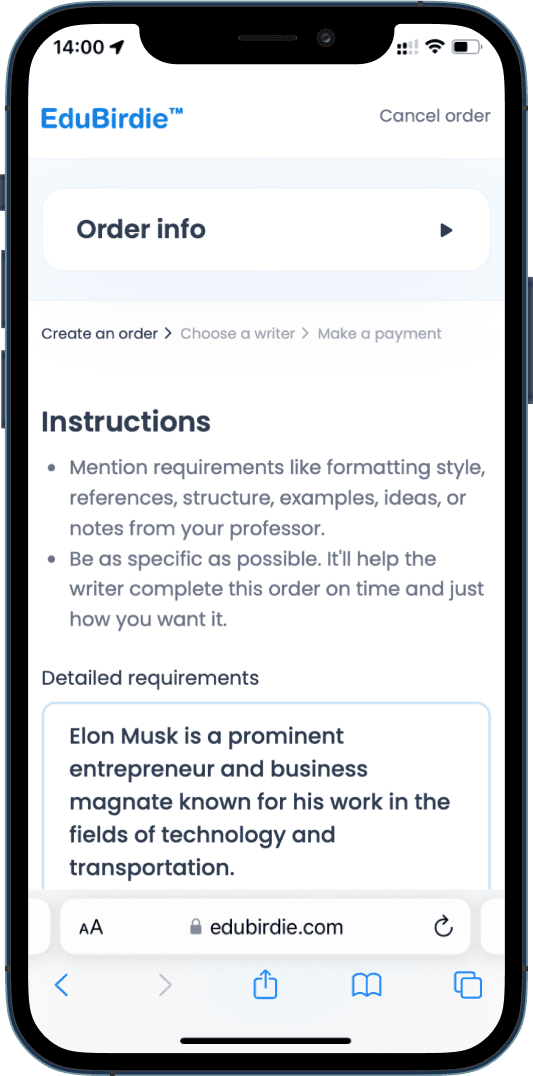
The mobile ordering flow was not optimized for smaller screens, leading to a poor user experience. Analytics showed significantly lower conversion rates compared to the desktop version.

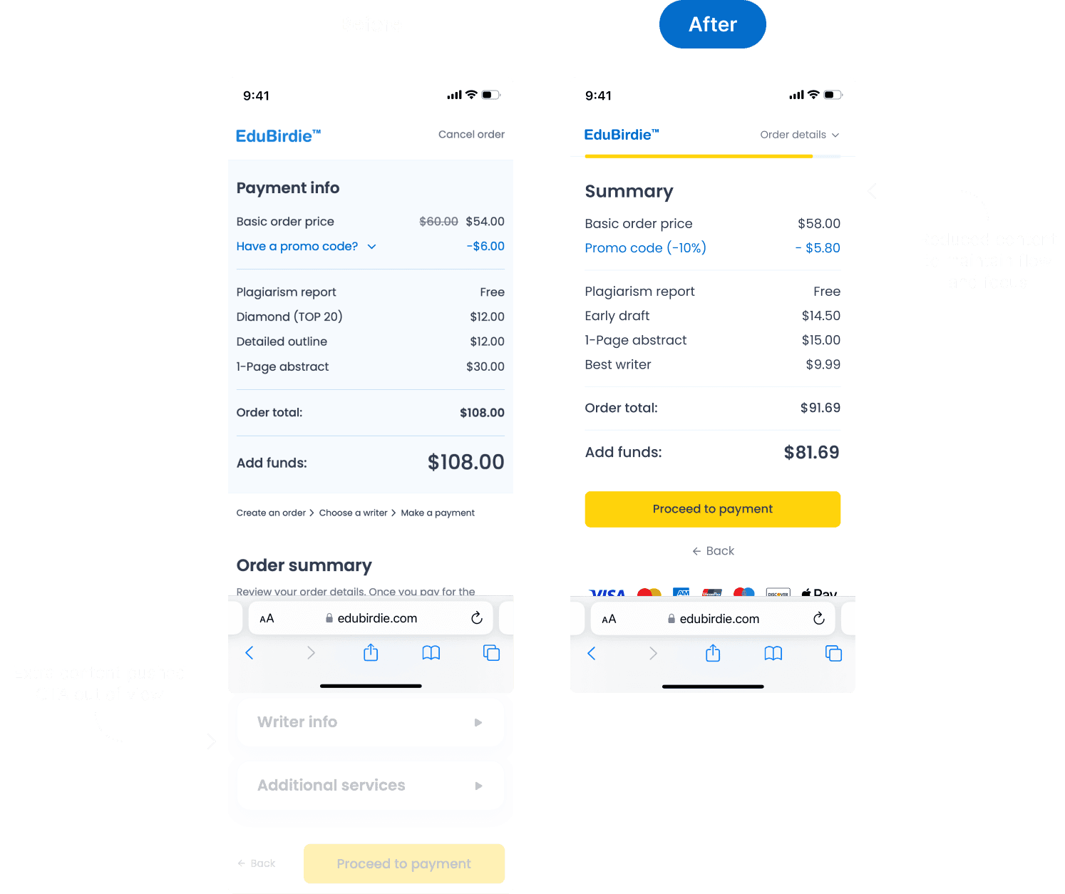
Hidden Primary Action
The primary action button was often positioned below the fold, causing confusion. Users were unsure how to proceed and frequently had to scroll to find the next step, interrupting the flow and increasing drop-off risk.
Example
After selecting the required category, users were left with no visible guidance on what to do next. Many either hesitated or began scrolling in search of the way forward.
Impact
This led to a break in user momentum. The need to scroll for essential actions created friction and made the experience feel longer and more frustrating, ultimately reducing conversion.
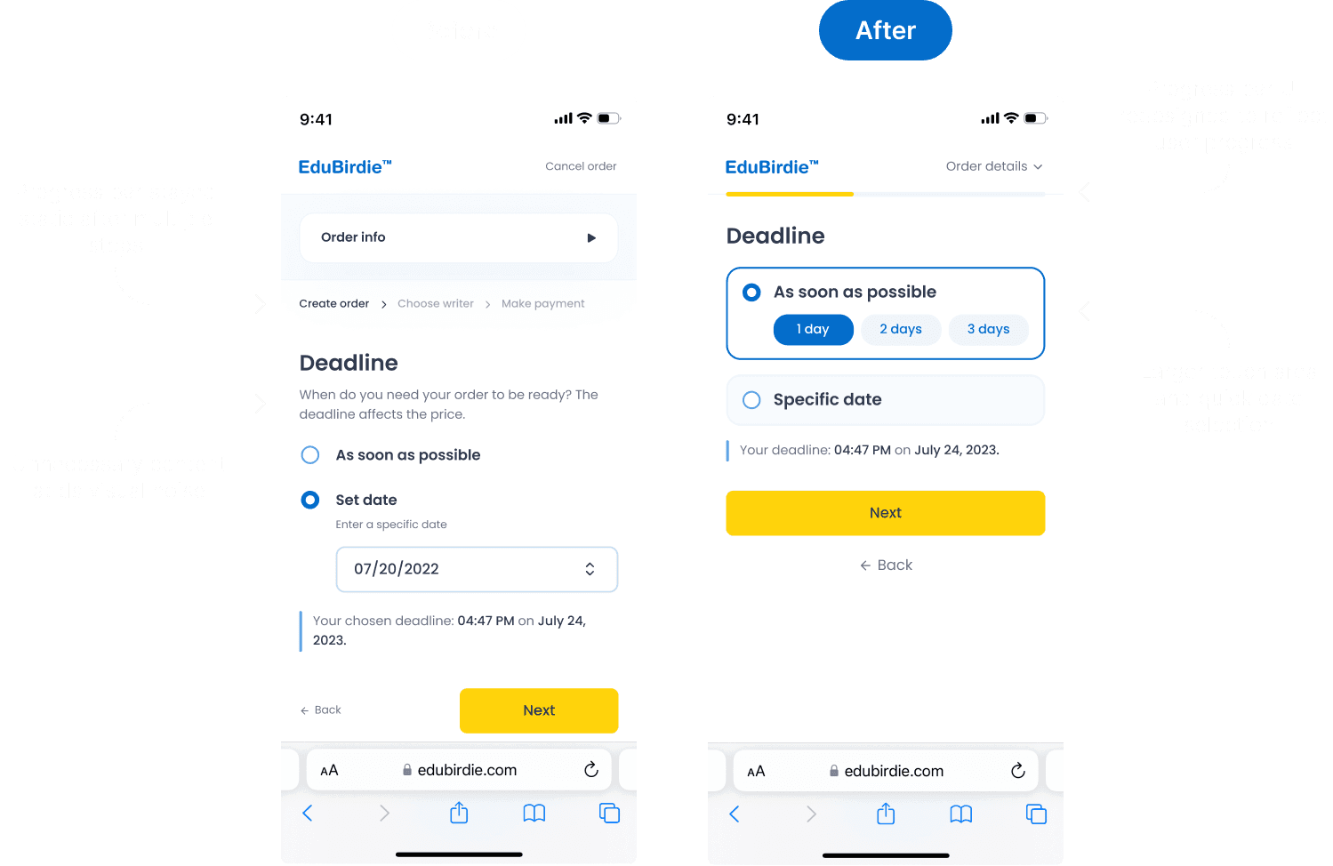
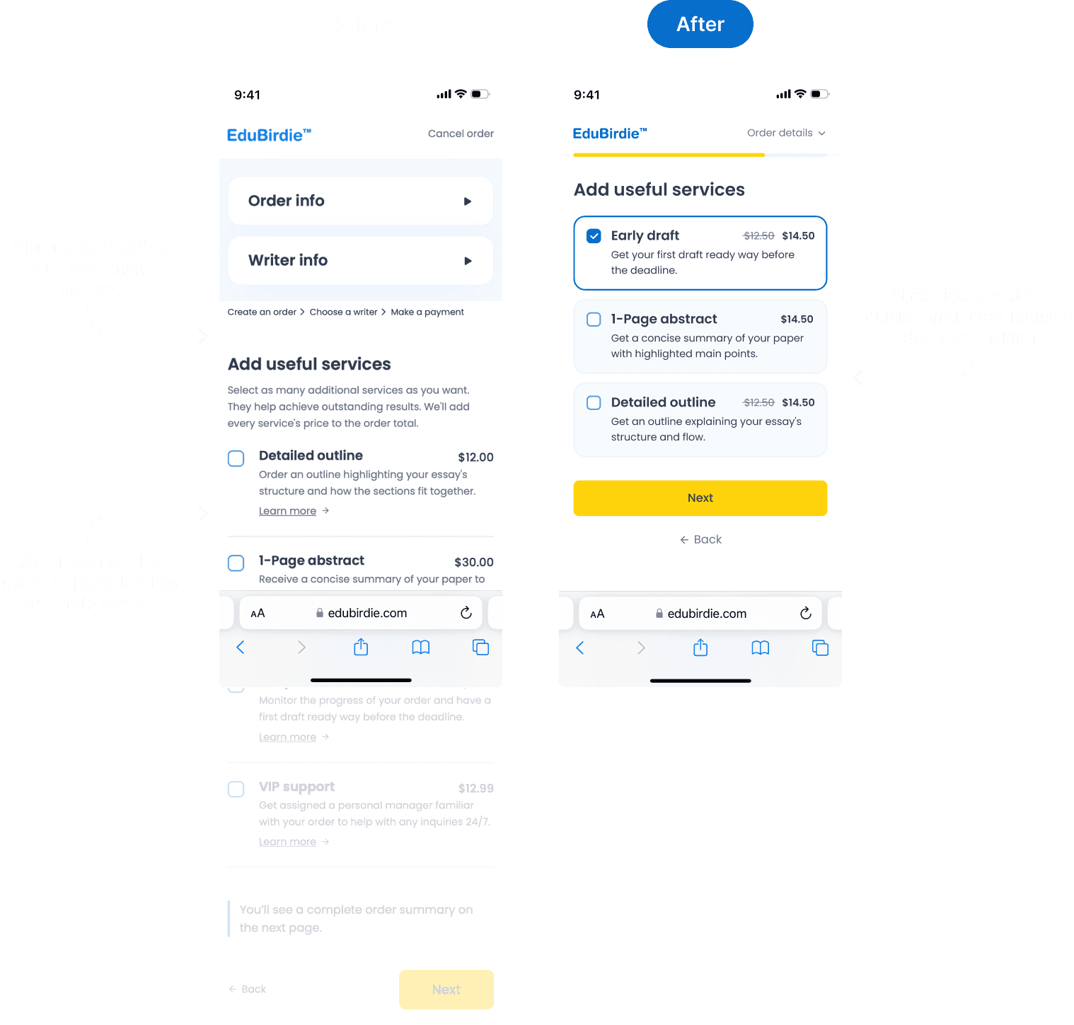
Lack of Progress Visibility
Users had no clear indication of where they were in the process or how many steps remained. This caused confusion and a sense of stagnation, especially within multi-step flows.
Example
The “Create an order” stage included several sub-steps, but users didn’t see their progress. As a result, they often felt stuck or assumed the system wasn’t working.
Impact
Unclear progress led to user hesitation, support requests, and drop-offs, as people weren’t sure how far they’d come or how close they were to finishing.
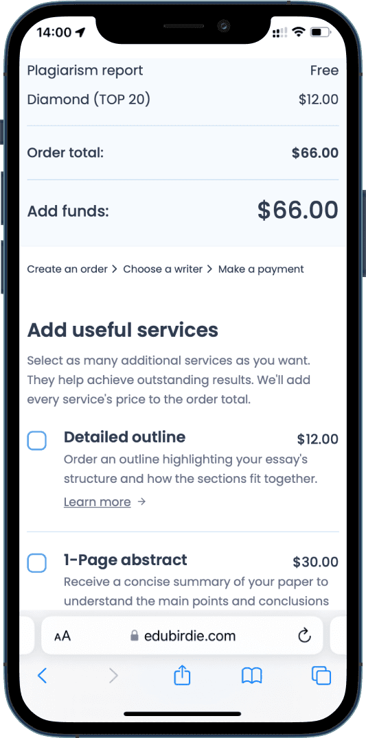
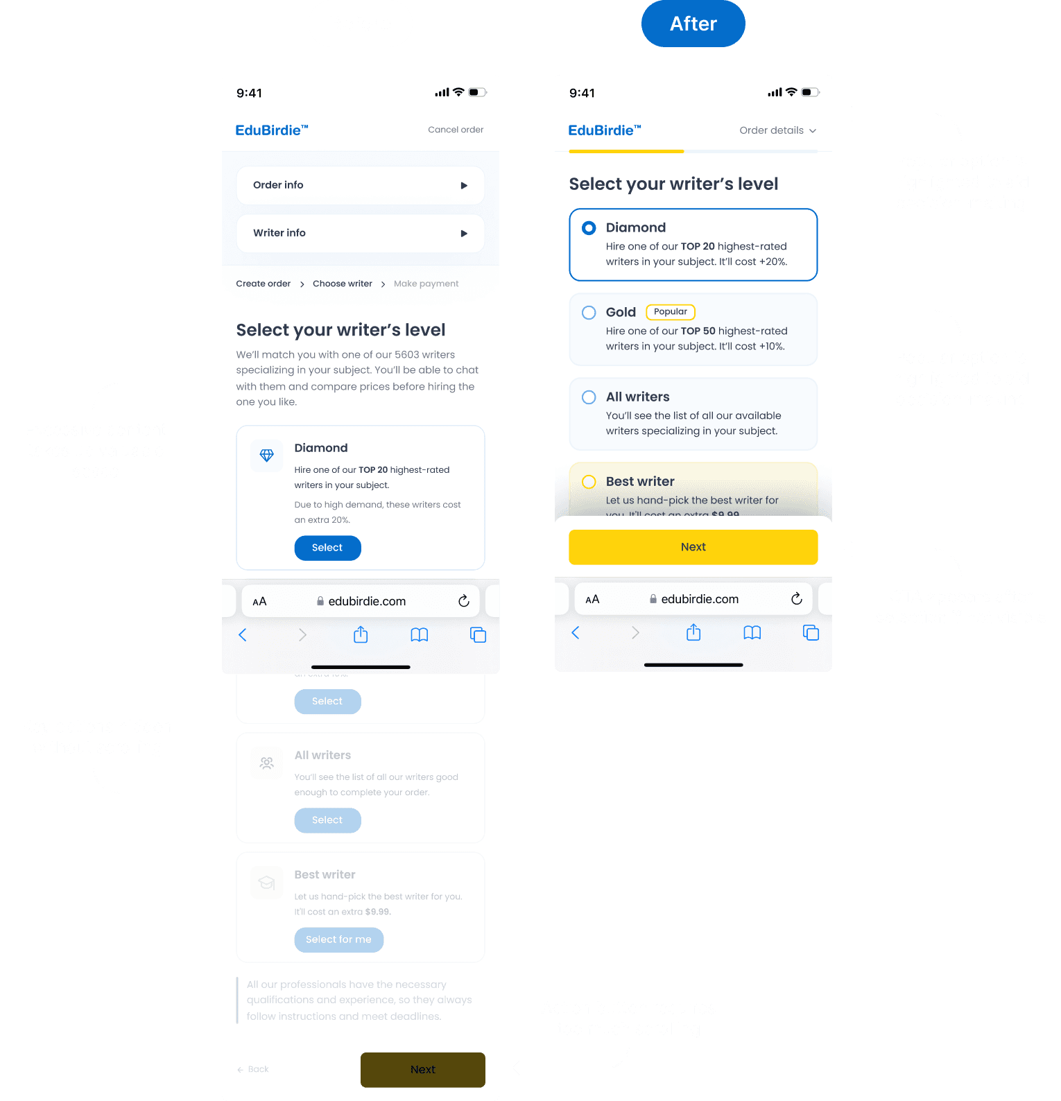
Overwhelming and Unclear Content
Throughout the funnel, users encountered content that felt excessive, irrelevant, or hard to understand. This diluted their focus and made it harder to complete key actions.
Example
Screens contained too much unclear information, making it difficult for users to understand what was expected of them or where to focus. This often caused distraction and hesitation.
Impact
Information overload led to confusion and frustration. Users often didn’t understand what was required, reached out to support for clarification, submitted incorrect task details, or abandoned the form altogether.
Our users
To improve the mobile experience, we analyzed product analytics, reviewed support tickets, and conducted quick surveys and interviews.
We focused on understanding why users come to Edubirdie and what stops them from completing an order.
Based on this, we defined 3 core personas and mapped them to their key jobs-to-be-done.
The Stressed Out Student
An overwhelmed college or university student juggling multiple deadlines and responsibilities. Often an international student or non-native English speaker who seeks help to avoid falling behind.
JTBD
When I’m overloaded with assignments, I want someone to help me complete an essay so I can avoid stress and meet my deadlines without risking my grades.

The Last-Minute User
A student who tends to procrastinate and places orders at the very last moment. They need a fast and reliable way to get academic help without delays or complications.
JTBD
When I remember I have a paper due tomorrow, I want to place an order in minutes and be sure it’ll get done on time.

The First-Time Buyer
A cautious, budget-conscious user who is new to such platforms. They need clarity, transparency, and reassurance before placing their first order.
JTBD
When I try this service for the first time, I want to feel confident in the process, understand every step, and trust the person doing the work.

Design Sprints
We ran design sprints with a Project Manager, UX Writer, and Business Analyst to align on key user problems and solutions. I led brainstorming sessions and collaborated with developers to balance design ideas with technical constraints. The result was four iterations of the design, each bringing us closer to an optimal user experience.

Solution Validation
To ensure our design decisions were effective, we ran several types of validation activities. These included quick hallway testing with colleagues unfamiliar with the product, structured usability testing sessions, and feedback from real users. This mix of informal and formal methods helped us identify blind spots early and iterate with confidence. The insights we gathered played a key role in refining our final solution.

User Flow
We simplified the order process by removing confusing screens and merging logically related steps. The new flow is more intuitive, guiding users from simple actions to more complex ones in a smooth, structured way. To reduce early friction, we moved the login step closer to the end — allowing users to focus on their task first, without being blocked by account-related barriers.

Why iPhone 12 resolution?
Analytics showed that most users access the service from mobile devices with screen sizes close to the iPhone 12 (1170×2532 px). That’s why we used it as the reference device during design and testing.

Final Design
The final version brings together all key improvements: a simplified user flow, improved readability, clear hierarchy, and a mobile-first approach based on real user behavior.


Impact
in Numbers
Key stats that reflect the impact of our mobile funnel redesign
and its effect on user experience and conversion.
+34%
Mobile conversion rate
-28%
Funnel drop-offs
-42%
Time to complete order